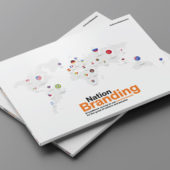
An old (from 2002) yet interesting article about some of the aspects Poland approached in its nation branding effort (source here):
Hitting on the idea of the kite was ”like finding gold in the street,” Szymon Gutkowski says. Gutkowski is the managing director of DDB Corporate Profiles, an advertising agency in Warsaw. A kite, he says, connotes youth, freedom, playfulness and hope ”in any language, any country.” It floats gracefully above nations and politics. ”It’s extremely positive.” And soon it may become Poland’s national logo.
Last year, Poland’s Ministry of Foreign Affairs hired DDB Corporate Profiles, a branch of the global agency DDB, to design a logo that could be used to promote tourism and trade. This summer, the company unveiled its design: a red-and-white kite whose tail is held by a dancing stick figure that doubles as the K in the word ”Polska.” The Polska lettering is thick, red and curvaceous, a nod to the emblem of the Solidarity movement. The red-and-white design on the kite is a four-square checkered pattern, reminiscent of the emblem on Polish warplanes.
You might wonder why Poland needs a logo. It already has a nice flag, a band of white resting on a band of red, and an emblem, the white eagle. The problem is that the eagle is too traditional and too common. (Germany, Russia and the United States all have eagles as national emblems.) And ”flags have nationalist, military or political connotations,” Wally Olins, a British branding consultant, says. The kite is postpolitical. It represents a break from the past, Olins adds. ”It is joyful, modern.”
And commercial. Like the Nike swoosh or McDonald’s golden arches, the kite is an advertisement. It says: Come here. Buy our stuff. Eat our food. We’re not grim. We’re fun. ”We want to target the worldwide consumer. We want to show we are a young, dynamic country,” Gutkowski says, adding that ”politicians now realize that a country is a brand.’‘ And as with any other brand, people have associations, good or bad, with the nations they know. But can you change people’s minds by repackaging, rebranding a nation?
In 1999, Olins’s old company, Wolff Olins, proposed that Germany, the land of beer, Hitler and lederhosen, could be transformed in the eyes of the world into a warm and friendly nation ”by replacing black in the current national colors with the European blue.” The tip was not taken.
A few years earlier, Wolff Olins had made another suggestion – that Great Britain, a stuffy nation with a queen, a palace and rain, could seem like a more hip and happening place if it erased the ”Great” from its name and ditched the Union Jack. ”We feel that the Union Jack is no longer representative of a modern Britain,’‘ Wolff Olins’s Web site proclaimed, because ”it stands for imperialism in many parts of the world.’‘ In 1998, the British rebranding effort was taken up by Prime Minister Tony Blair’s much derided ”Cool Britannia” campaign. A pop version of ”God Save the Queen” greeted the queen at a meeting of the Commonwealth. And British Airways infamously decided to replace the Union Jack colors on its planes’ tail fins with psychedelic, multicultural designs.
Why does anyone think national rebranding works? Because of Spain. Two decades ago, Joan Miró designed a splashy, sunny national emblem to promote tourism. Thanks in part to the España logo, Spain is no longer associated just with Franco, the Spanish Civil War and Don Quixote. It is a country of wine (Rioja), movies (Pedro Almodóvar) and art (Miró).
But in the case of Poland, rebranding is different because the idea came from the government. After years of Communist rule, Poland, rushing to emulate what it sees as modern Western ways, has put itself in the hands of DDB Corporate Profiles, an ad agency whose greatest local success to date has been a beer campaign.
Last summer, the agency started thinking about what kind of brand Poland should be, but first it had to find out what kind of brand the country already was. Anna Koszur, the brand consulting director of DDB Corporate Profiles, assembled groups of foreigners to free-associate about Poland. Their responses included gray, cold, vodka, poor, white, unsmiling, friendly, sad, boring, hard-living, fast-driving, hard-working, car-stealing, argumentative, creative, chauvinistic, chaotic, conservative, romantic, sentimental, anti-Semitic, Catholic, Walesa, Solidarity, Auschwitz, Chopin.
”What they thought about Poland is that they were quite afraid of it,” Gutkowski says.
Poles don’t have a very good image of themselves either. When Koszur brought Poles into focus groups, they rated themselves brave, romantic, patriotic and strong, but also irrational, impatient, disorganized and argumentative; they said they love blood, martyrdom and alcohol. How to turn the tide?
The design process took about a year. First came a logo of a white eagle, representing Poland, surrounded by the yellow stars of the European Union. Then came a logo with three different colored blocks — red, yellow and blue — with white stars inside each one. The stars kept multiplying, a sign that the designers were fixated on showing Poland among the European nations. The unspoken hope was that Poland could escape Eastern Europe by joining the European Union. (The slogan for the rebranding campaign is ”Poland: Europe Is Bigger.”) At one point, the K of Polska was drawn as a white star. At another point, the artist drew a blue horn of plenty with yellow stars and fire coming out of it. The Ministry of Foreign Affairs asked, What is it, a snake?
Finally, riffing on the theme of liberation rather than European union, Wojciech Mierowski, the creative director of Brand Nature Access, the branding arm of DDB Corporate Profiles, drew a kite. At first he formed the kite’s tail out of white stars on a blue background. Then he shaped it like the Vistula River. Next he had the kite’s tail cross the shape of Poland and wrote the name Polska under it. Finally the K of the Polska grabbed hold of the tail of the kite. The ministry loved it. It was youthful, fun and, well, not already claimed.
Many countries have commercial or tourist logos. Canada has a maple leaf. Hungary has a heart. Holland has a tulip. Estonia has a yellow sun with bands of blue, black and white beneath. But no one has a kite. ”It was out there to be taken,” Gutkowski says. What’s more, it was deemed an appropriate heir to the Solidarity logo. Gutkowski says, ”A dancing group of people flying a kite with Poland’s colors” has taken the place of protesters carrying a bloody flag.
What do foreigners think of the new logo? A brief survey of Americans yielded these responses: Charlie Brown with his kite stuck in a tree, Thing One and Thing Two in ”The Cat in the Hat,” Ben Franklin in the lightning storm and the brush-off ”Go fly a kite.” Not a peep about Poland. And not unambiguously good associations.
”It’s bourgeois,” Lawrence Weschler, the director of the New York Institute for the Humanities, who wrote a paean to the Solidarity logo years ago, says. ”It’s capitalist. It says life is a holiday.” And that dancing K, he added, is derivative. Franz Kafka used it in his drawings of Joseph K.
Tom Geismar, a partner at the graphic design firm Chermayeff & Geismar, which created the NBC peacock, says that the new logo ”is sort of fussy — the kite and the string.”
Rafal Olbinski, a Polish-born artist who works in the United States, says, ”The kite is uplifting, but maybe too childish’‘ for a nation that is 1,000 years old. It also ignores Poland’s tradition of surreal posters, those dark and elliptical designs created to befuddle Communist censors.
Maybe design isn’t everything, though. After all, logos ‘‘take on the meaning of the things they represent,” Geismar says.
Think of the swastika. It began in India as a symbol of good fortune. In the early 20th century, it appeared on beer bottles and girls’ club magazines. It was a great design. Then came Hitler. Or think of the hammer and sickle. That wasn’t a very strong design, Olins says, but it became a very powerful image. In both cases, the logo’s meaning was pounded in. The Nazis and the Soviets saturated their nations with these symbols and regulated how and when they were used. Albert Speer, Hitler’s creative director, made sure the swastika would appear ”on aircraft, racing cars, everything,’‘ Olins says.
”It’s hard to get consistency without a dictatorship,” he adds, almost wistfully.
Will the Polish kite take off? Who knows? But regardless, Poland has broken some strange new ground with its logo. It’s not just that the government of Poland has spearheaded the rebranding process, but also what the logo itself implies. What sets the kite apart from all other logos is that it is painfully, almost pathetically, honest about what is expected from it. The hope is that the kite will lift Poland up and let it float gently away from its past and toward the prosperity of Europe.
”Why has Poland depicted itself as a day at the beach?’‘ Weschler asks. ”I don’t know. Maybe if you lived its history, you might want a day at the beach.”
– *Article by Sarah Boxer, a reporter for the Arts & Ideas pages of The Times.